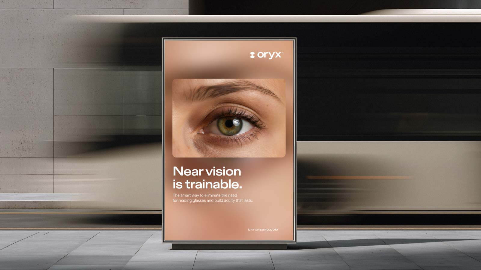
Oryx Neuro is developing a new approach to age-related near-vision decline: instead of compensating for it with reading glasses, its technology trains the brain’s visual processing to improve near vision.

Our work was to turn a complex scientific proposition into a clear, relevant brand – one that could introduce a new category, build trust around an unfamiliar technology, and speak to people about what better vision actually gives them.

The positioning centered on independence. Reading a menu, using your phone, working, driving at night – small everyday moments that begin to change as vision declines. Oryx offered a different possibility: train what can still be strengthened.

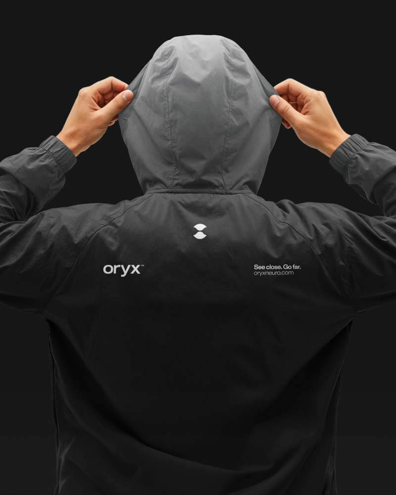
See close. Go far. became the idea at the heart of the brand.

Brand identity  | Website | Social assets | Animation 

The value of better near vision goes beyond clarity.

Relying less on reading glasses means holding on to something much bigger: independence.

We developed the strategy, messaging, visual identity, and digital experience around the relationship between vision and the brain. Focus and blur became an active part of the visual language, supported by a stark black-and-white system, a distinctive violet light, direct portraiture and a symbol built around the act of seeing.

Credits

Strategy & Messaging
David Laxer

CMO
Jonathan Hepner

Design
Shirley Ohava
Tamar Gil

Code & Dev
W4 – The Web Workshop

Motion
Alex Kogan
–
Tommy Clements

More Cases