Gr8day, an impact investment fund led by David Arison, invests in pioneering innovations to resolve the world’s most fundamental social & environmental issues.
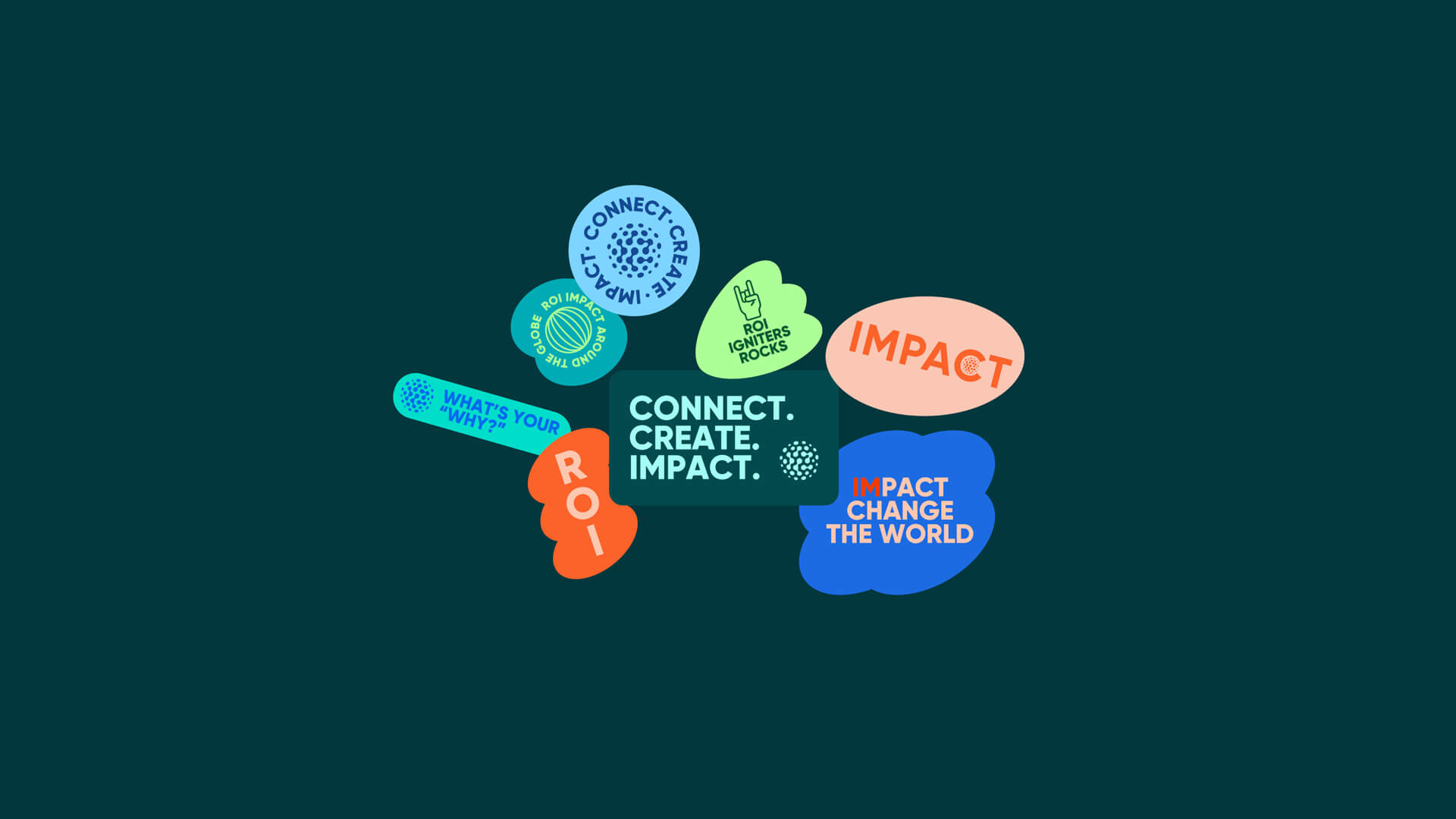
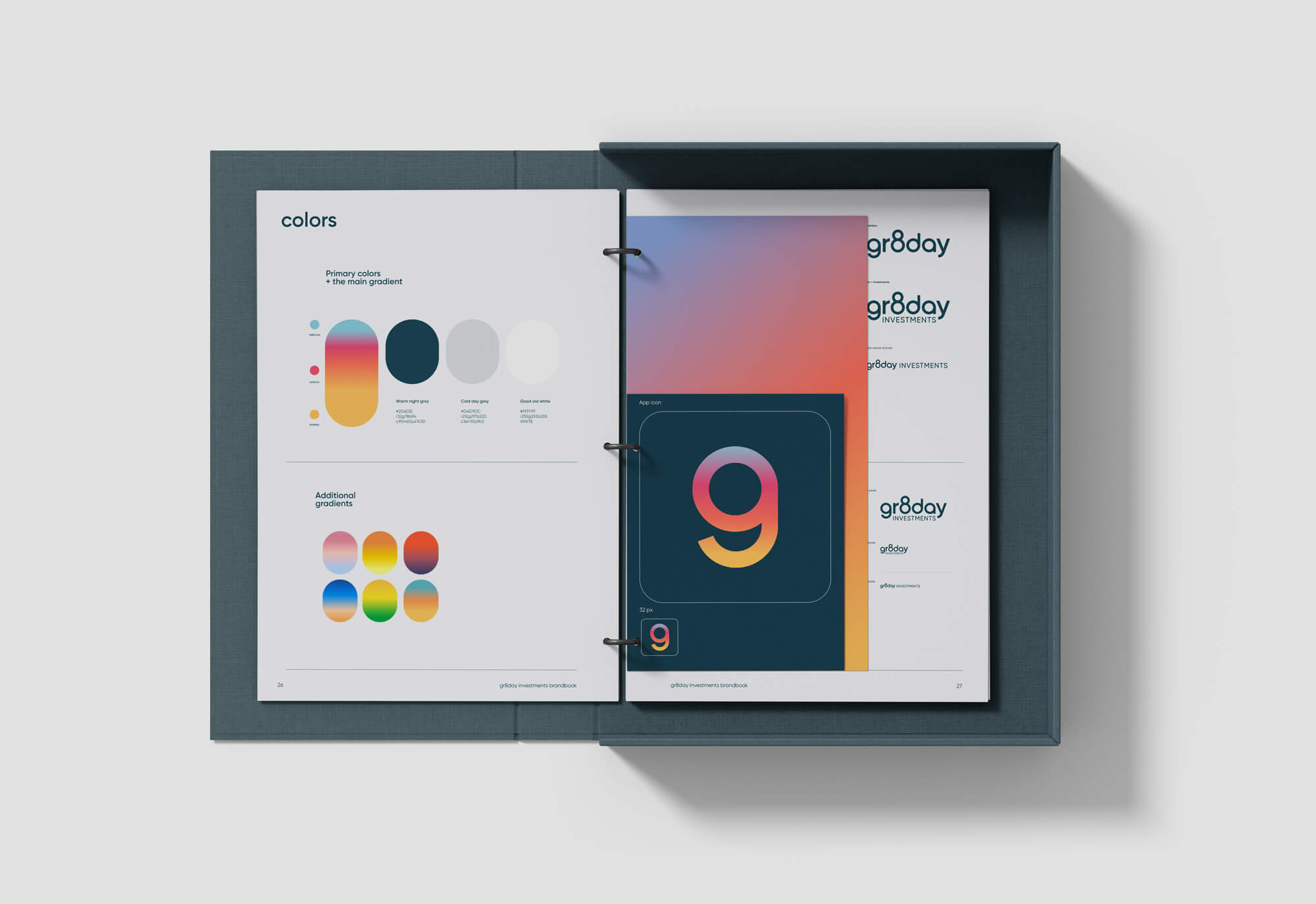
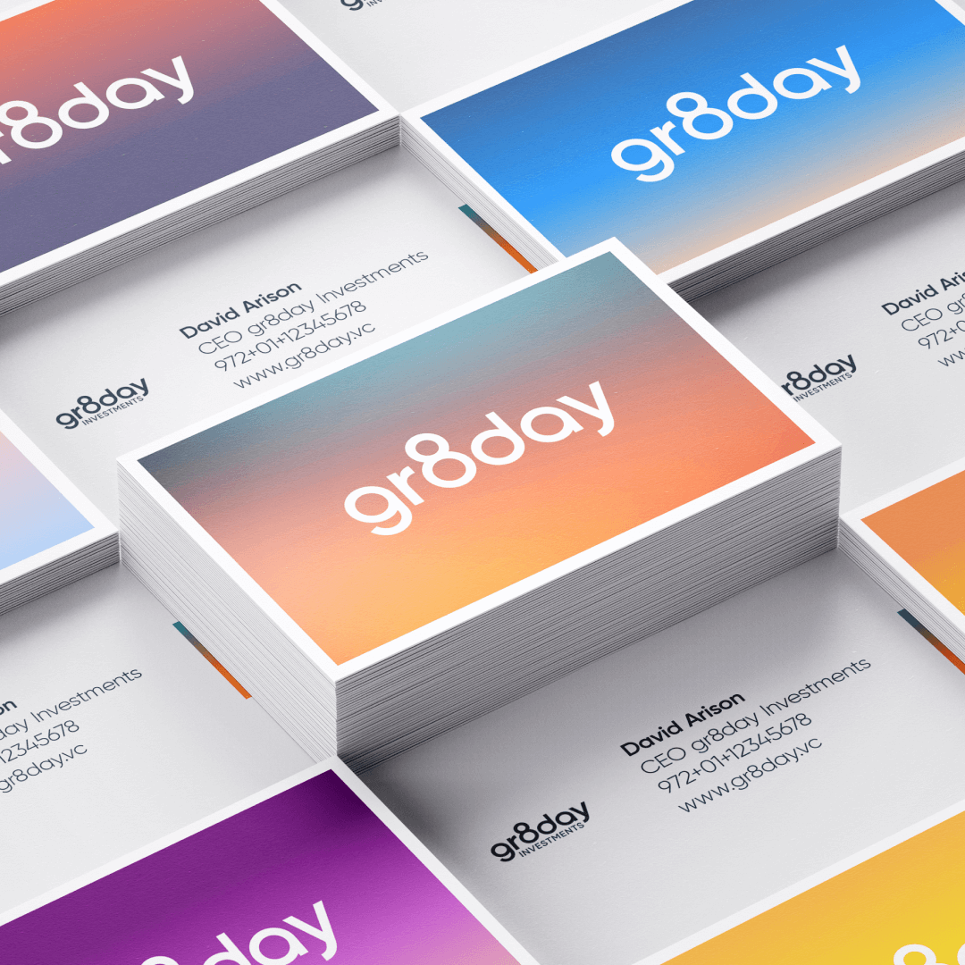
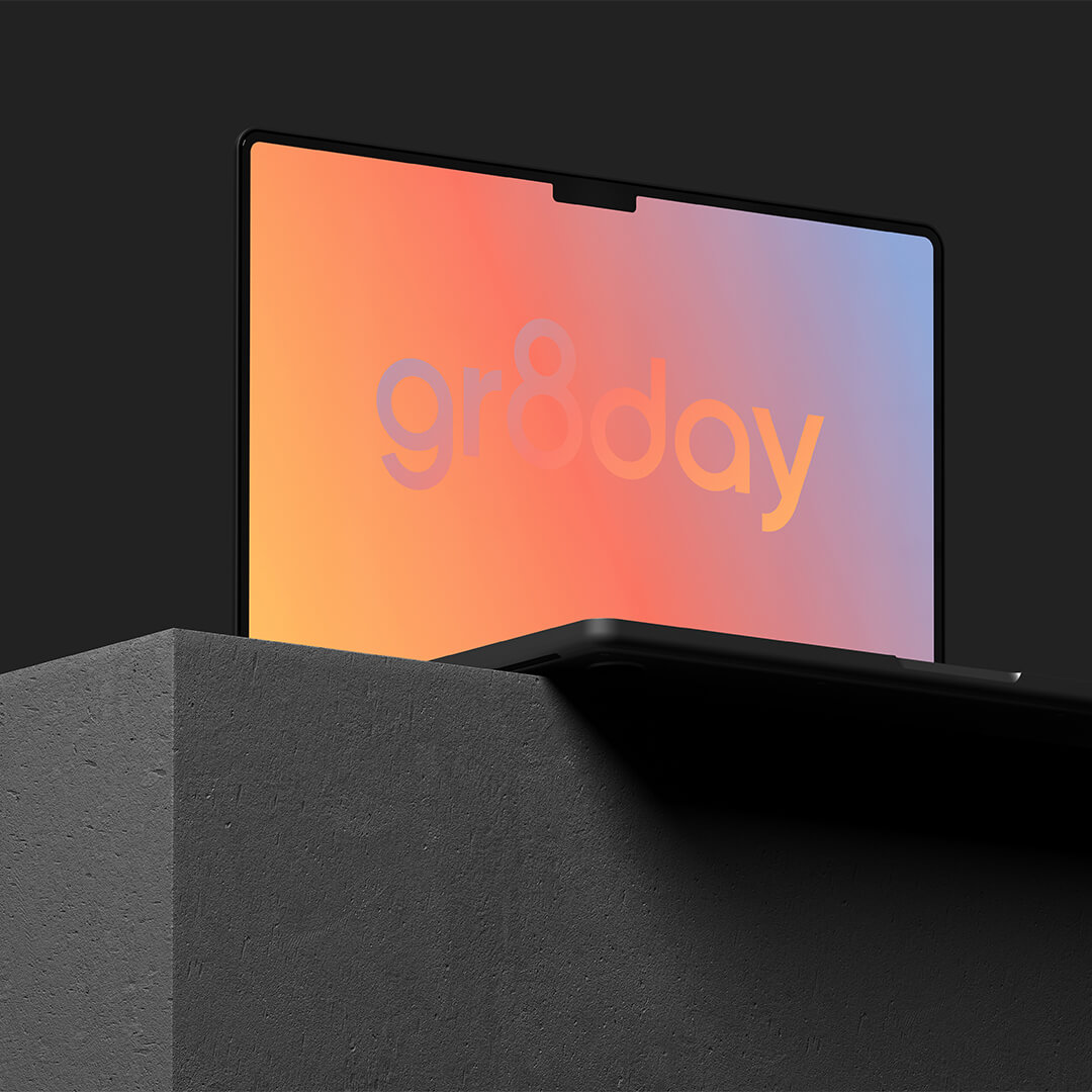
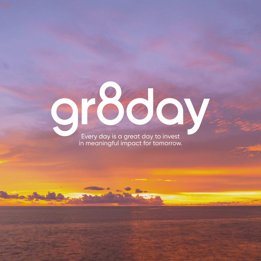
Befitting an optimistic brand, We incorporated the creative concept in the logotype, with the number 8 creating a slick disruption that stands out and captures the tech zeitgeist.
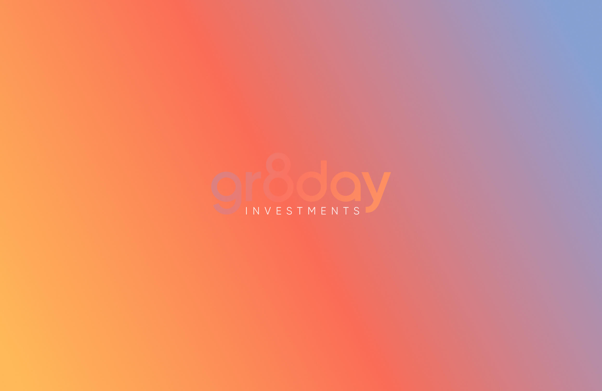
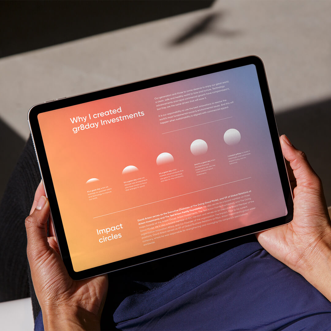
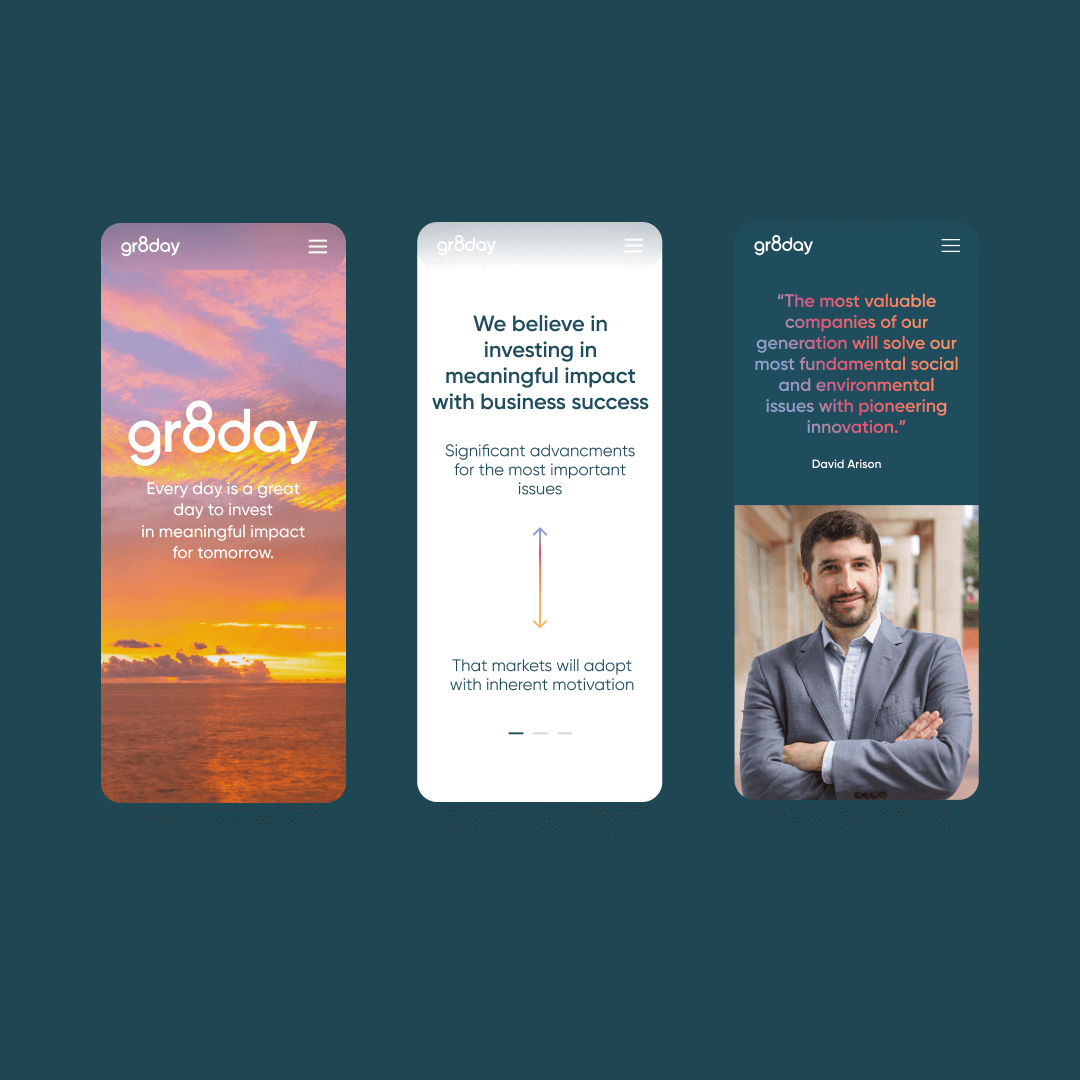
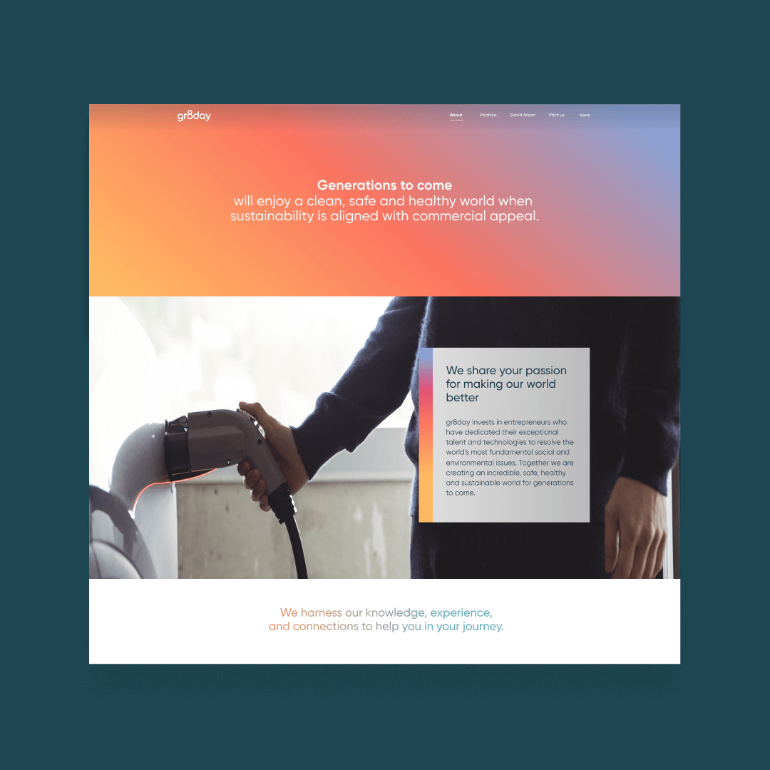
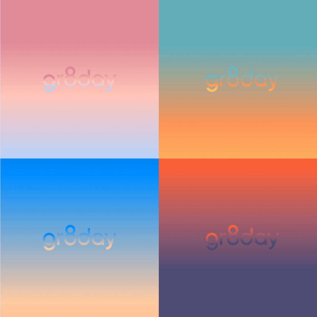
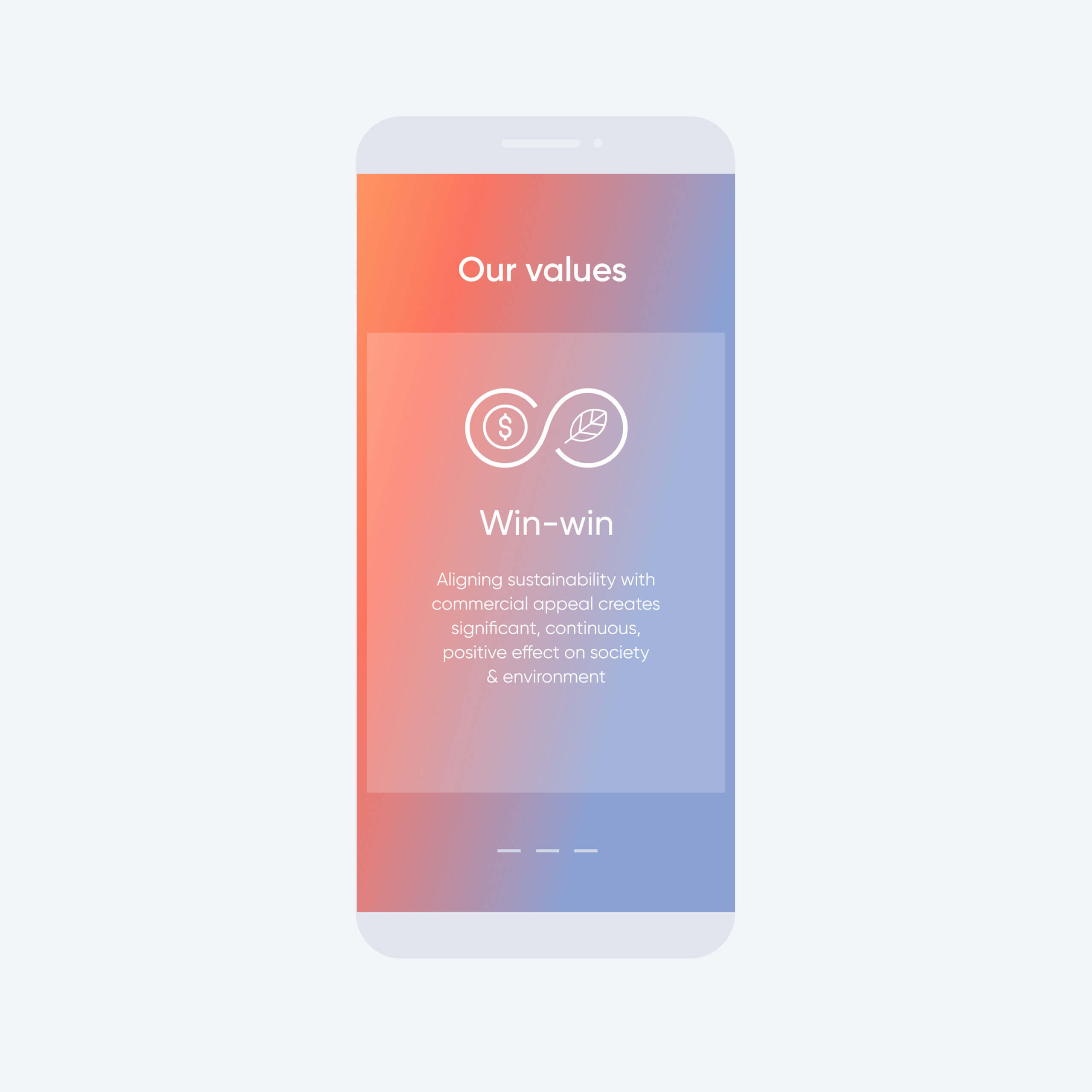
The gradient color palette was a fundamental element, inspired by the different spectrums of color that occur during sunrise – a key concept of the strategy based on the dawning of a new era.
These elements are complemented by realistic, imperfect footage imagery taken from the company’s core areas of investment and represent what will be fixed.
Finding the right balance between doing good and doing well; ie, between real impact on the environment and good, strong business.
There is no impact without funding, and in order to make the case for good business we needed to convey both credibility and a sense of optimism / inspiration that what we do transcends the mere world of transactions. That is a heady proposition, and one that required a subtle visual world that plays in 2 worlds; impact & technology; the real and the ethereal
More Cases